Brand guidelines manual: what it is, what it includes and how to use it
A brand guidelines manual is the guide with the rules for applying a company’s brand: logo usage, clear space and minimum sizes, colours with their HEX, RGB and CMYK codes, typefaces and hierarchies, photography style, tone of voice and application examples. It allows the team, the printer or an agency to use the brand the same way without having to ask. For an SME, a short, practical manual is enough, together with the files and templates.
1 / 8What a brand guidelines manual is
A brand guidelines manual is the document that says how your brand is used: which versions of the logo exist, which exact colours, which typefaces, what the photos look like and how the company writes. Without it, everyone applies the brand their own way and in two years you have five different logos in circulation. In this guide we explain what it includes, with examples of sections and of real manuals, how it is made and how it is used so that it does not end up forgotten in a folder.
What a brand guidelines manual is
It is your brand’s instruction book. It gathers all the decisions of the corporate identity (logo, colours, typefaces, images, tone) and turns them into rules anyone can follow.
You will also hear it called a brand manual, style guide, corporate identity manual or brand book. In an SME, they are all the same thing.
It has one goal: for your brand to look and sound the same whoever produces it. The designer who made your logo will not be there when the printer asks for the colour in CMYK, when someone on your team prepares a presentation or when an agency designs an ad. The manual will.
«A logo without a manual lasts as long as it takes someone to stretch it to fit a banner.»
GNERAI team
What a brand guidelines manual is for
Consistency
The website, social media, signage and quotes look as if they come from the same company.
Speed
Nobody wastes time asking which blue it was or where the good logo is.
Independence
You can change printer, designer or agency without losing the brand.
Savings
Fewer rounds of changes and fewer reprints due to mistakes.
Protection
The brand does not degrade with every new piece.
What a brand guidelines manual includes
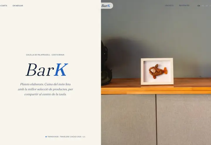
This is the typical contents page of a brand guidelines manual for an SME. Not every business needs every section, but the first four should never be missing:
| Section | What it covers |
|---|---|
| 1. The brand | Who you are, who you are aimed at, values and positioning on one page. It is the reason for everything else. |
| 2. Logo | Versions, construction, clear space, minimum size, permitted backgrounds and incorrect uses. |
| 3. Colour | Primary and secondary colours with HEX, RGB, CMYK and Pantone codes, and in what proportion they are used. |
| 4. Typography | Families, weights, heading and body hierarchy, and an alternative font for Word, PowerPoint and email. |
| 5. Graphic elements | Your own icons, shapes, patterns or textures and how they are combined with the logo. |
| 6. Photography and illustration | Style, light, framing, colour treatment and which images are not used. |
| 7. Tone of voice | How the brand writes, with examples of phrases that are in and phrases that are out. |
| 8. Applications | Stationery, email signature, social media, website, presentations, signage, vehicles and uniforms. |
| 9. Resources | Where the files are, in which formats and who to ask. |
The logo: the most consulted section
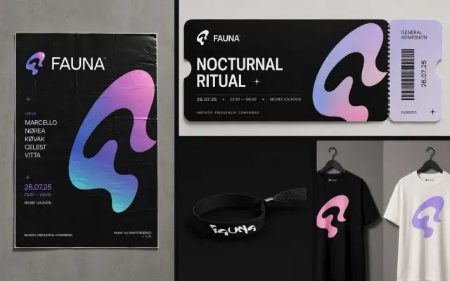
It should include every version (main, horizontal, vertical, symbol only, reversed and single-colour) and say when each one is used. The most useful parts are three rules: the clear space (the empty space that must surround the logo), the minimum size at which it can still be read well, in millimetres for print and pixels for screen, and the incorrect uses, with visual examples: stretching it, changing its colour, adding a shadow or placing it over a photo that makes it hard to read.
Colour: codes, not impressions
Each brand colour needs its codes for each use: HEX and RGB for screens, CMYK for print and Pantone if you print a lot or with special inks. Without them, each supplier matches the colour by eye and your red ends up as three different reds. Add the proportions too: which colour leads and which ones accompany it.
Typography: including the everyday kind
The most common mistake is defining a beautiful typeface that nobody on the team has installed. A good manual includes the brand typeface and an alternative available on any computer for documents, presentations and emails. That way, the quotes your team sends out also look like your company’s.
Brand guidelines manual: example sections
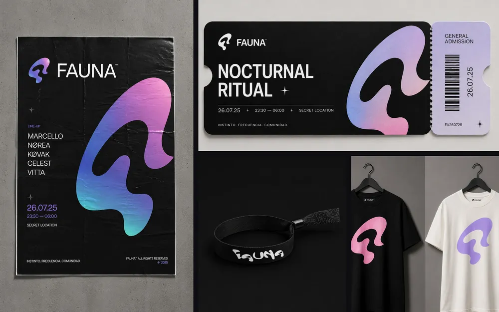
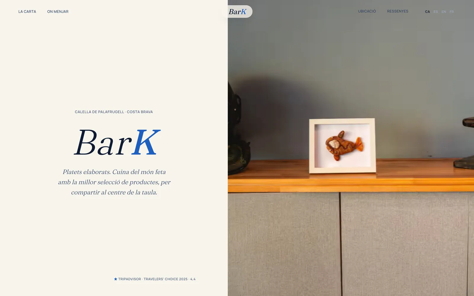
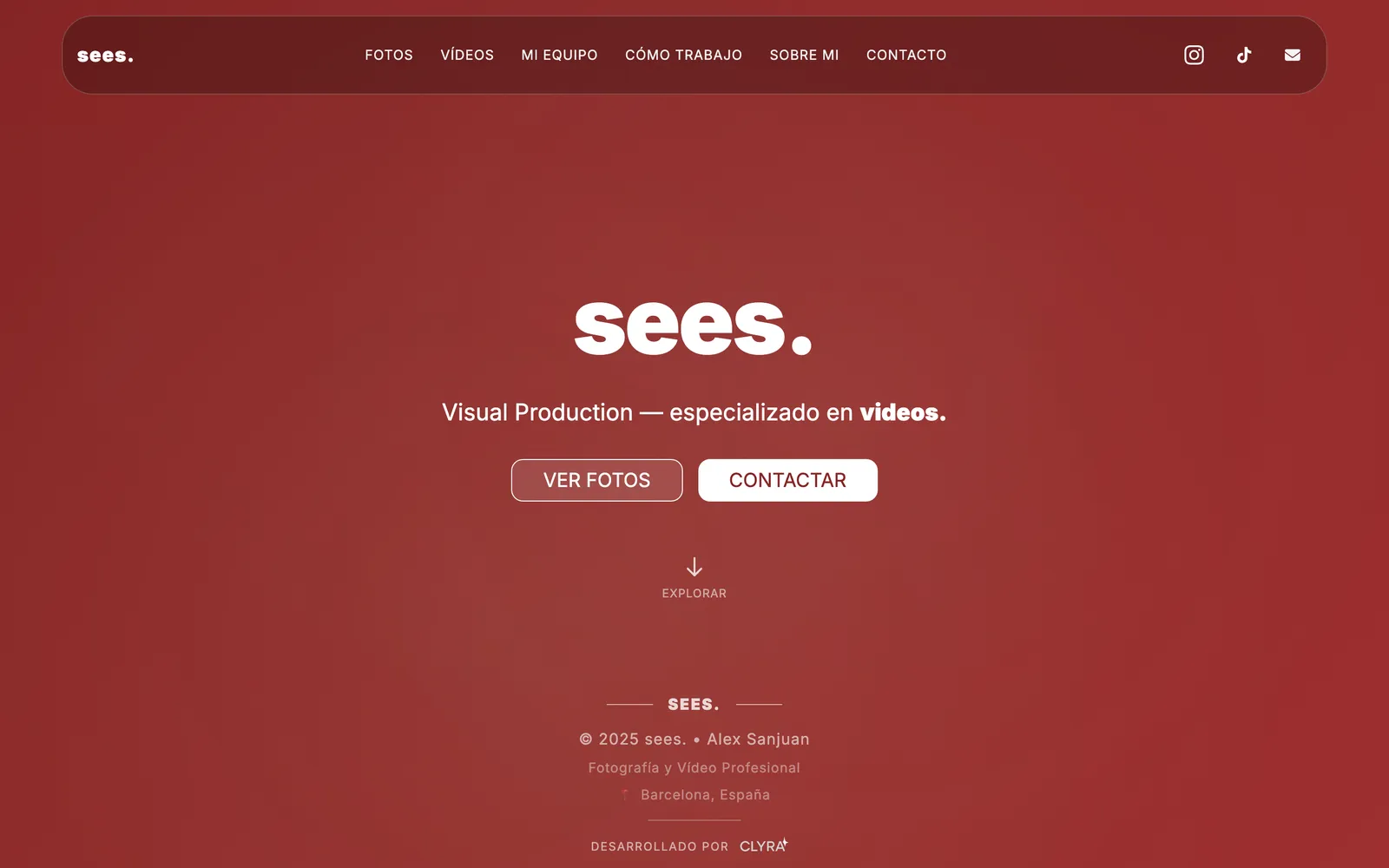
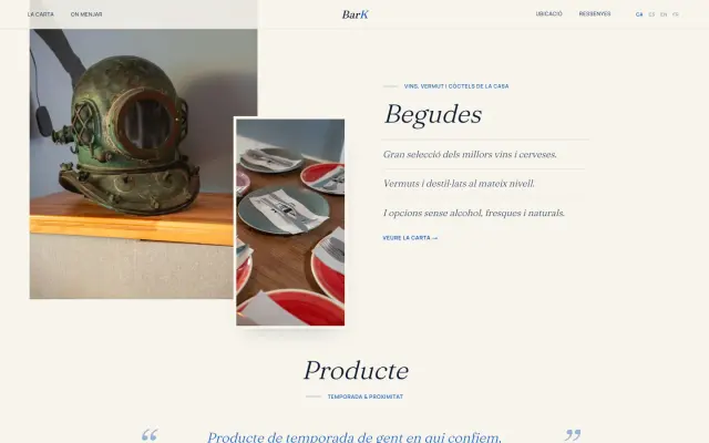
A useful manual does not explain theory: it gives rules that can be applied without thinking. This is what the rules of a practical manual sound like. The measurements are examples only; in your manual they will come from your logo:
| Section | Example rule |
|---|---|
| Clear space | A margin equal to the height of the letter “a” in the name is always left around the logo. No text or image enters that space. |
| Minimum size | The full logo is not used below 25 mm wide on paper or 100 px on screen. Below that, only the symbol is used. |
| Backgrounds | On light backgrounds, the colour version. On dark backgrounds or photos, the white version. Never over busy photos behind the logo. |
| Colour | The brand green takes up at most a third of the piece. The rest, white and dark grey. |
| Typography | Headings in the brand font, bold weight. Body text in the secondary font. In Word documents, the specified alternative. |
| Photography | Real photos of the team and the work, in natural light. No stock photos of people posing. |
| Tone | We speak informally. Short sentences. We state prices and timescales. We avoid “end-to-end solutions” and “industry leaders”. |

Examples of manuals you can look at
Looking at real manuals helps you understand the level of detail. Two you can consult:
- NASA’s Graphics Standards Manual (1975). It was designed by the studio Danne & Blackburn for the logo known as the “worm”, which the agency retired in 1992. It was reissued as a book in 2015 after a Kickstarter campaign, as reported by Space.com and It's Nice That. It is a classic for its clarity: each page solves a specific case, from stationery to vehicles.
- The identity manual of the Xunta de Galicia (the regional government of Galicia). It publishes it on its website, with a section on the identity elements and another for downloading the manual. It is a good example of how a large organisation brings order to many different applications.
Use them as inspiration for the structure, not the length. A public administration or a space agency needs hundreds of cases; an SME, a few dozen well-thought-out pages.
Basic guide or complete manual: what your SME needs
| Basic brand guide | Complete brand guidelines manual | |
|---|---|---|
| Who it is for | Businesses that are starting out or use few media. | Companies with a team, several channels or external suppliers. |
| What it covers | Logo and versions, colours, typefaces and incorrect uses. | All of the above plus graphic elements, photography, tone of voice and applications. |
| Templates | Email signature and a social media template or two. | Presentations, quotes, social media, stationery and signage. |
| When to expand it | When you hire people or open new channels. | When the brand changes or a new medium appears. |
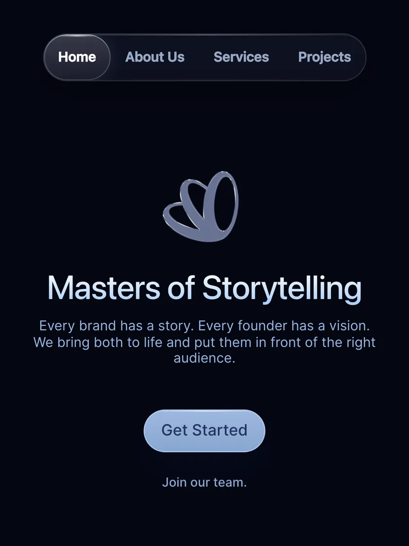
A short guide that gets used is better than an 80-page PDF nobody opens. Start with the basics and expand the manual when reality calls for it.

How to make a brand guidelines manual
A manual is made at the end of an identity project, not before: the strategy and design have to be finalised first. From there, these are the steps:
- Gather the decisions. The final logo with all its versions, colours with codes, typefaces, image style and tone. If a decision is missing, it is taken now, not in the manual.
- List the real media. Where your brand will be seen: website, social media, signage, van, quotes, uniforms. Those are the examples the manual has to resolve.
- Write rules, not theory. Each page should answer a specific question: “which logo do I use on a dark background?”, “which font do I use in Word?”.
- Show incorrect uses. Visual mistakes are understood better than a thousand explanations.
- Prepare the files. Logo in SVG, PNG and PDF, in colour, black and white; fonts or links to download them; editable templates.
- Test it with an outsider. Give the manual to someone who was not involved and ask them to produce a piece. Wherever they hesitate, a rule is missing.
- Give it a version number and date, and decide who maintains it.
Format: PDF, website or design file
The classic format is a PDF, easy to send to any supplier. More and more companies complement it with a shared folder or an internal page with downloadable files and templates, which is updated without resending anything.
For an SME, the practical option is a clear PDF and a well-organised folder with everything the PDF mentions.
If you have not defined your identity yet, the manual is not the first step. Start with the brand strategy and design; the manual is what fixes them. If your brand is outdated, perhaps what you need is a rebrand.
How the manual is used day to day
A manual that stays in a folder is no use. For it to work, it has to reach whoever does things with your brand:
Your team
Whoever prepares quotes, presentations or posts on social media. They should know where the templates are.
The printer and the sign maker
The manual and the vector files, always, before asking for a proof.
Whoever builds your website
Colours, typefaces and logo in screen formats. It is the most demanding application.
Whoever runs your ads
Google Ads or Meta Ads creatives are also part of the brand.
Any new designer
With the manual, they do not have to start from scratch or reinterpret your brand.
Mistakes that turn a manual into a forgotten PDF
- It is so long that nobody reads it all.
- It explains concepts instead of giving rules.
- It does not include the files or templates, so nobody can apply it.
- It was only designed for paper and says nothing about the website, social media or video.
- Nobody updates it, and reality goes one way and the manual another.

How much a brand guidelines manual costs
The manual is almost never sold on its own, because it depends on the identity being well defined. At GNERAI, the visual identity (from €1,000) includes a basic usage guide, and complete branding (from €2,000) includes the brand manual with tone of communication.
If you already have a brand that works but was never documented, we make the manual for you with a fixed quote based on what needs sorting out.
You will find what each phase includes in branding for SMEs in Barcelona and, if you are in the Maresme, in branding in Mataró. The other services are in prices.
We'll send you our next branding guide
Naming, identity and small-business brand examples whenever we publish. No spam.
Guides for your business, in your inbox
What we publish on websites, SEO, ads and AI for small businesses. No spam, unsubscribe in one click.
Frequently asked questions
What is a brand guidelines manual?
It is the document with the rules for applying a company’s brand: logo versions and uses, colours with their codes, typefaces, image style, tone of voice and application examples. It makes the brand look the same whoever produces it: your team, a printer or an agency.
What should a brand guidelines manual include?
At a minimum: the logo with its versions, clear space, minimum size and incorrect uses; the palette with HEX, RGB and CMYK codes; the typefaces with their hierarchy and an alternative for documents. A complete manual adds graphic elements, photography, tone of voice and applications.
How do you make a brand guidelines manual?
First finalise the identity: logo, colours, typefaces and tone. Then list the media where the brand will be seen, write specific rules for each one, show incorrect uses, prepare files and templates, and test it with someone who was not involved. Give it a version number and date and decide who updates it.
Is a brand manual the same as a corporate identity manual?
In practice, yes. Brand manual, identity manual, style guide or brand book are used for the same thing. Sometimes “brand manual” includes more strategy and tone, and “identity manual” focuses on the visual side, but for an SME what matters is that it covers both.
How many pages does a brand guidelines manual have?
As many as it takes to resolve your real cases, and not one more. A basic guide can fit in a few pages; a complete manual for a company with many media is longer. Better short and used than lengthy and forgotten.
Can I make the manual if I already have a logo?
Yes, if the logo and colours work. The decisions that already exist are gathered, the missing ones are completed (versions, colour codes, alternative typeface) and everything is documented. If on review you see that the brand does not hold up, a redesign may be needed first.
In what format is the manual delivered?
Usually a PDF, together with a folder containing the logo in SVG, PNG and PDF, the typefaces or where to get them and the editable templates. The PDF explains the rules; the folder lets you apply them.
How often should the manual be updated?
Whenever something about the brand changes or a new medium appears that the manual does not cover: a social network, a vehicle, an ad format. Give it a version number and date so everyone knows which is the latest.
Further reading
Is your brand applied a different way every time?
Take the free digital check-up in 2 minutes. Within 24 hours we tell you whether you need a manual, a new identity or simply to bring order to what you already have.