Corporate identity: what it is, its elements, examples and price
Corporate identity is the visual and verbal system a company uses to present itself: the logo and its versions, colour palette, typefaces, graphic elements, photography style and tone of voice, gathered in a manual so they are applied the same way everywhere. It is not just the logo. At GNERAI, a visual identity with logo, colours, typefaces and a basic guide starts at €1,000, and a complete branding project with strategy and manual at €2,000.
1 / 8Your logo is not your brand
Corporate identity is the set of elements your company uses to present itself: logo, colours, typefaces, graphic style and way of speaking. Done well, it gets you recognised and taken seriously before you say a word. In this guide we explain what it is, what elements it has, what it looks like in real businesses, how it differs from corporate image, how it is created and how much it costs.
Your logo is not your brand
There is a moment almost every SME owner we work with recognises: you send a proposal to a big client and something does not fit. The service is good, the price is fair, but the image does not convey what your company is worth.
The logo was made by someone eight years ago. The colours are the PowerPoint defaults. The email signature uses a different typeface from the website.
The problem is not aesthetic, it is one of perception. If your image says “improvised”, the client assumes your processes are too. A consistent corporate identity does not make you a better company, but it makes it obvious that you are one.
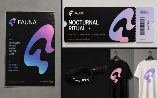
«A corporate identity without strategy is a logo without context. And a logo without rules ends up in five different versions within two years.»
GNERAI team
What corporate identity is
Corporate identity is what the company decides about how it presents itself: how it looks, how it sounds and by what rules. It has a visual part (the visual corporate identity: logo, colour, typography, images) and a verbal part (name, slogan, tone).
Both are set out in a manual so that anyone on the team, a printer or an agency applies them the same way.
The difference between corporate image and corporate identity
They are used as synonyms, but they are not. Identity is what you define and control: the logo, the colours, the tone. Image is what people perceive of you after seeing your identity, dealing with your team and reading your reviews.
You design the identity; the image you earn. A good identity does not guarantee a good image, but a neglected identity almost always makes it worse.
| Concept | What it is | Who controls it |
|---|---|---|
| Branding | The whole process of building the brand: strategy, positioning, name and identity. | You, with your team or an agency |
| Corporate identity | The visual and verbal system: logo, colours, typefaces, tone. | You |
| Corporate image | What the public thinks and feels about your company. | The public |
| Brand guidelines manual | The document with the rules for applying the identity. | You |
The elements of corporate identity
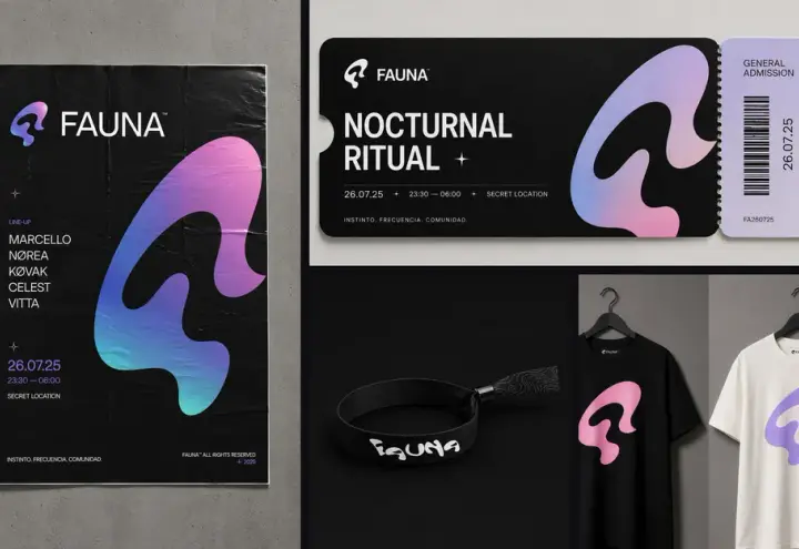
These are the elements of an SME’s corporate identity. They do not all carry the same weight, but if one is missing, someone will end up improvising it:
| Element | What it includes | Typical mistake |
|---|---|---|
| Logo | Main, compact, horizontal, vertical, reversed and single-colour versions. | Having only a PNG on a white background. |
| Colour palette | Primary and secondary colours with HEX, RGB and CMYK codes, and Pantone if you print a lot. | Each supplier matching the colour by eye. |
| Typefaces | A primary and a secondary one, with heading and body hierarchies, and an alternative for Word or email. | Using paid fonts that nobody on the team has installed. |
| Graphic elements | Your own icons, shapes, textures or patterns that make the brand recognisable without the logo. | Pulling different generic icons into every piece. |
| Photography and illustration | Style, framing, light, and which kinds of images are in and which are out. | Mixing stock photos with phone photos. |
| Tone of voice | How the brand writes: formal or informal address, its own words and banned words. | The website sounding like a bank and social media like a mate. |
| Applications | Business cards, email signature, quote templates, social media, signage, uniforms. | Designing the logo and leaving the applications “for later”. |
What you should receive from an identity project
- Brand strategy: positioning, values and value proposition, in writing.
- The logo in all its versions: main, compact, single-colour and reversed.
- Colour palette with HEX, RGB and CMYK codes for screen and print.
- Type system with primary and secondary fonts and their hierarchy.
- Brand guidelines manual: usage rules, spacing, correct and incorrect uses.
- Basic applications: business cards, email signature, templates for social media and presentations.
- Editable, well-organised files, not just a PDF.
Without a manual, the identity degrades within months: everyone applies the logo their own way and in two years you have several versions in circulation. We explain what one contains in the guide to the brand guidelines manual.
Corporate identity: examples applied to SMEs
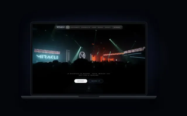
The best way to understand corporate identity is to see how the decisions change with the business. Three examples of corporate identity in typical SMEs in Barcelona and the Maresme:
| Business | What it has to convey | Identity decisions |
|---|---|---|
| Car repair garage | Trust, clarity, honest prices. | A logo legible from a distance (sign and van), few strong colours, a direct tone, real photos of the garage and the team. |
| Beauty clinic | Care, cleanliness, professional results. | A soft palette with one accent colour, an elegant typeface that is still legible on mobile, natural-light photography, a warm tone without exaggerated promises. |
| Law firm | Seriousness, experience, discretion. | A restrained logo with a good single-colour version for documents, a serif typeface for headings, templates for letters and presentations, a formal but clear tone. |
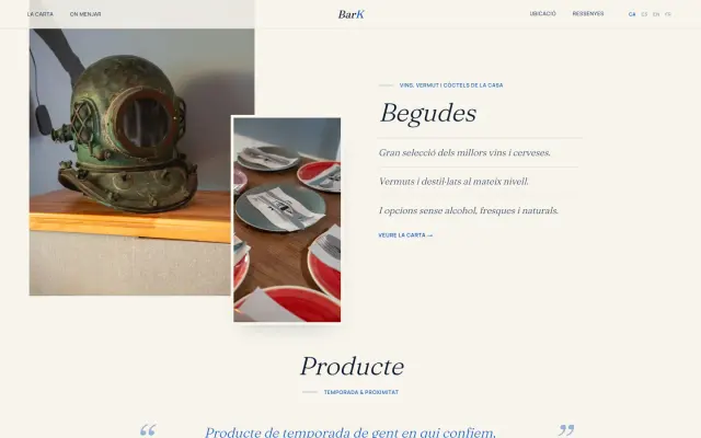
Notice that no decision starts with “which logo do I like”. It starts with what the client has to feel and where they will see you. A garage lives on signs and vans; a law firm, on documents and the website.
One of ours: Altura Private Estates
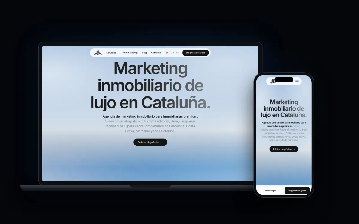
For Altura Private Estates, our luxury real estate marketing division in Catalonia, the brand had to speak to a premium owner who does not respond to cold calls, but to perception, discretion and authority.
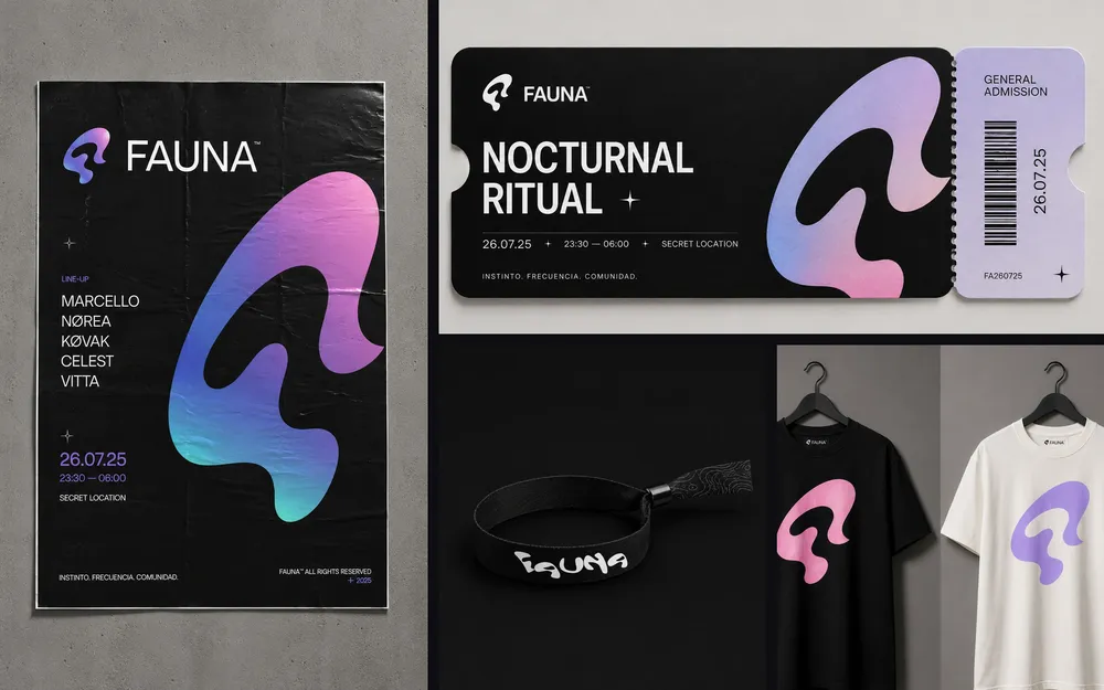
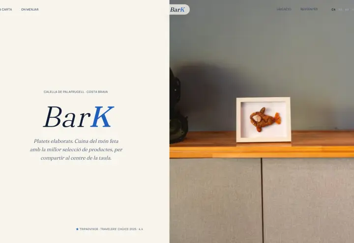
That is why the identity was developed alongside editorial photography and cinematic video: it is not just the logo, it is everything that goes with each piece.
Visual corporate identity on the website
The website is now the most important application of your identity, and the most demanding: the logo has to work at 32 pixels as a favicon, the colours need enough contrast to read well and the typefaces have to load quickly.
That is why it pays to design the identity with the screen in mind from the start, rather than adapting it afterwards. If you are going to renew both, take a look at our web design in Barcelona service.

How to create your company’s corporate identity
At GNERAI we develop corporate identity in four phases. Most of the value lies in the first two, before any design appears:
- DiscoveryWe get to know the business, the client, the competition and what the brand has to communicate. If you do not know who you are, you cannot design how others see you.
- Strategy and conceptWe define the positioning, the brand territory and the references before opening any design software.
- DesignWe present different proposals with their basic applications. You choose a direction and we refine it.
- DeliveryBrand guidelines manual, files organised in every format and instructions so that any future supplier knows how to use the brand.
A basic visual identity usually takes 3 or 4 weeks; a complete project with strategy and manual takes longer. The dates are always in the proposal.
Corporate identity brief: what to prepare before you start
A good corporate identity brief saves weeks and rounds of changes. It does not need to be long: if you answer the following in writing, any designer or agency will work much better.
- What you do and for whom, in two sentences. And which client you want to have in three years’ time, if it is not the same one.
- What sets you apart from your three most direct competitors, by name.
- Three adjectives that should come to mind when someone sees your brand, and three that should not.
- Where the brand will be seen: website, social media, signage, vans, uniforms, packaging, documents.
- What has to be kept, if you already have a brand: a colour, a symbol, the name.
- Brands you like, even from another sector, and why.
- Budget and the date by which you need it applied.
Can I create the corporate identity myself?
With a template or an AI tool you can have a logo in an afternoon. What you will not have is the part that makes it work: the strategy behind each decision, the versions for each medium and the rules so that nobody spoils it.
For a project that is just starting and still validating the idea, that may be enough. For a company that already has turnover and wants to step up, it soon falls short.
How much a corporate identity costs
It is the question we are asked most. The price depends above all on how much strategy is behind it, how many applications you need and whether it includes naming. At GNERAI we work in phases and with a fixed quote:
| Project | What it includes | Price at GNERAI |
|---|---|---|
| Visual identity | Logo and variants, palette, typefaces, basic usage guide and essential applications. | From €1,000 |
| Complete branding | Strategy and positioning, complete visual identity, brand manual and tone of communication. | From €2,000 |
| Rebranding or brand with naming | Diagnosis of the current brand, naming, transition plan and bespoke applications. | Fixed quote |
What makes the price go up or down
Strategy
Starting from a clear positioning is not the same as having to build it.
Naming
Creating the name and checking trademark registration and domain is separate work.
Number of applications
A business card and a signature do not cost the same as signage, uniforms and packaging.
Depth of the manual
A basic guide or a complete manual with photography, tone and templates.
Rounds of changes
Always ask how many are included and what happens after that.
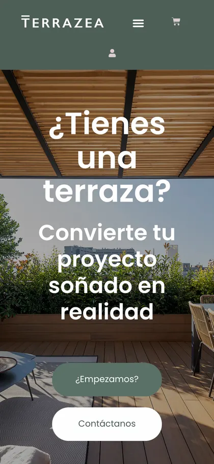
If you want to compare with other proposals, our branding for SMEs in Barcelona page sets out the usual market ranges and how to assess a quote. A quick rule: if you are offered a complete identity for very little, check what is included; it is almost always just a logo.
5 signs that your current identity is holding back your sales
It is not always obvious when your image is damaging the business. These are the signs we see most in SMEs that have had the same identity for years without questioning it:
- You win low-price projects but lose the ones you want most.
- You are embarrassed to send your website or your card to a certain kind of client.
- Your logo looks pixelated, distorted or different depending on where it appears.
- Nobody on the team knows which colours, fonts or tone to use when preparing something.
- You have not touched the identity for many years and your market has changed.
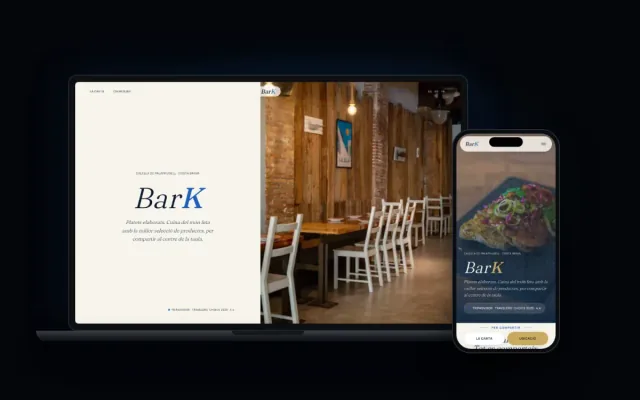
The quietest sign: someone asks for a quote after seeing your website and already expects you to be cheap. Your image has set the price before you speak. If you recognise several of these signs, it may be time for a rebrand.
What you can do this week
- Quick audit. Open your website, your LinkedIn profile, your last presentation and an invoice. Are the colours the same? Do the fonts match? Is there more than one version of the logo? If the answer is “no” or “I don’t know”, you already have your diagnosis.
- Define the real problem. Do you want to attract better clients, raise prices, move into another segment or stop being embarrassed by your image? The goal shapes the project and the budget.
- Talk to someone who has done it before, not so they can sell you something, but to find out whether it makes sense to invest now or whether you need to sort out other things first.
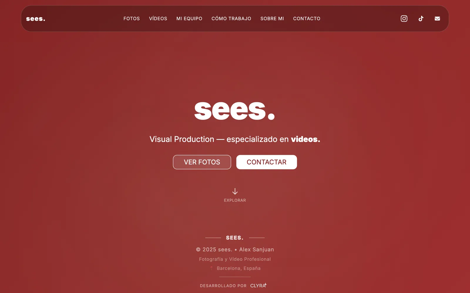
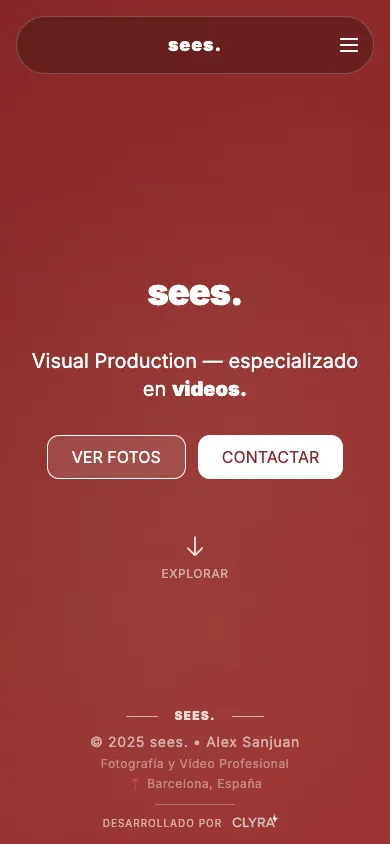
More real examples: SEES Production
We'll send you our next branding guide
Naming, identity and small-business brand examples whenever we publish. No spam.
Guides for your business, in your inbox
What we publish on websites, SEO, ads and AI for small businesses. No spam, unsubscribe in one click.
Frequently asked questions
What is corporate identity?
It is the set of visual and verbal elements a company uses to present itself: logo, colours, typefaces, graphic elements, photography style and tone of voice. It is set out in a manual so that it is applied the same way on the website, social media, documents and premises. It is not just the logo: it is the whole system.
What are the elements of corporate identity?
The basics are the logo with its versions, the colour palette with its codes, the typefaces, the graphic elements, the image style and the tone of voice. Added to these are the usage manual and the applications: business cards, email signature, templates, social media, signage or uniforms.
What is the difference between corporate image and corporate identity?
Identity is what the company defines and controls: logo, colours, typography and tone. Image is what the public perceives of you based on that identity and their experience with you. You design the identity; the image you earn over time and through how you work.
How much does a corporate identity cost for an SME?
At GNERAI, a visual identity with logo, colours, typefaces, a basic guide and essential applications starts at €1,000. Complete branding with strategy, identity, manual and tone of communication starts at €2,000. Rebranding or a brand with naming is priced with a fixed quote.
How long does it take to create a corporate identity?
A basic visual identity usually takes 3 or 4 weeks from when we start. A complete project with strategy, naming and manual takes longer. The dates are in the proposal and the applications are delivered in batches so you can start using the brand as soon as possible.
What is a corporate identity brief?
It is a short document in which you explain to whoever is going to design your brand what you do, for whom, what sets you apart, what the brand has to convey, where it will be seen and what you want to keep. A good brief saves rounds of changes and gets the proposals right sooner.
Do I need a brand guidelines manual?
If more than one person prepares materials for your company, yes. Without a manual, everyone applies the logo and colours their own way and the identity degrades within months. For an SME, a practical manual with logo usage, colours, typefaces, examples and templates is enough.
Further reading
Does your image live up to your company?
Take the free digital check-up in 2 minutes. Within 24 hours we tell you what is not working in your identity, whether a project makes sense now and how much it would cost, with no commitment.