What is a landing page, and why is yours not converting?
A landing page is a web page with a single goal: getting the visitor to take a specific action, such as leaving their details, booking or buying. Unlike the home page, it does not split attention across lots of links. It converts when it can be understood in 5 seconds, has one clear call to action, loads quickly on mobile, shows proof of trust near the form and asks for the minimum details.
1 / 9What a landing page is and what it is for
What is a landing page? It is a page designed for one thing only: getting whoever arrives from an ad, an email or a search to take a specific action, such as asking for a quote, booking or buying. Here you will find how it is structured, landing page examples that work, how to create one and the six mistakes that cost the most enquiries.
What a landing page is and what it is for
A “landing page” is literally the page where someone “lands” after clicking on a Google ad, an Instagram post or a link in an email. What sets it apart is not the design but the goal: one page, one offer, one action.
It is used to turn traffic into enquiries or sales. If you pay for every click, sending people to the home page is throwing money away: there are ten links, five services and no clear instruction.
On a landing page, someone who arrives searching for “emergency plumber in Mataró” sees exactly that, with a button to call.
Landing page or full website: which do you need?
| Landing page | Full website | |
|---|---|---|
| Goal | A single action | Explaining everything you do |
| Navigation | Minimal or none | Menu with several sections |
| Traffic | Ads, emails, specific campaigns | Google, social media, word of mouth |
| When to use it | For a campaign, a service or an offer | As the base of your online presence |
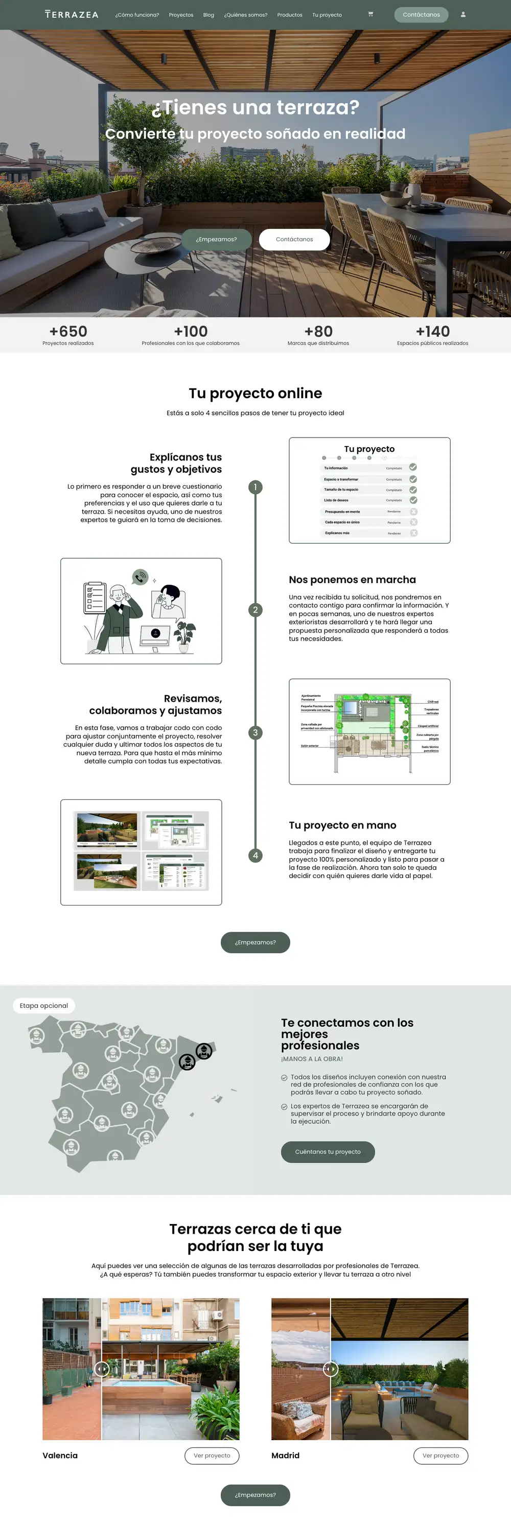
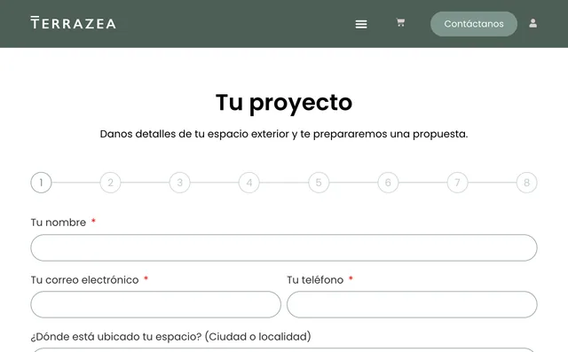
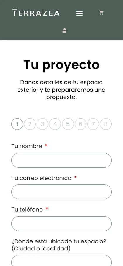
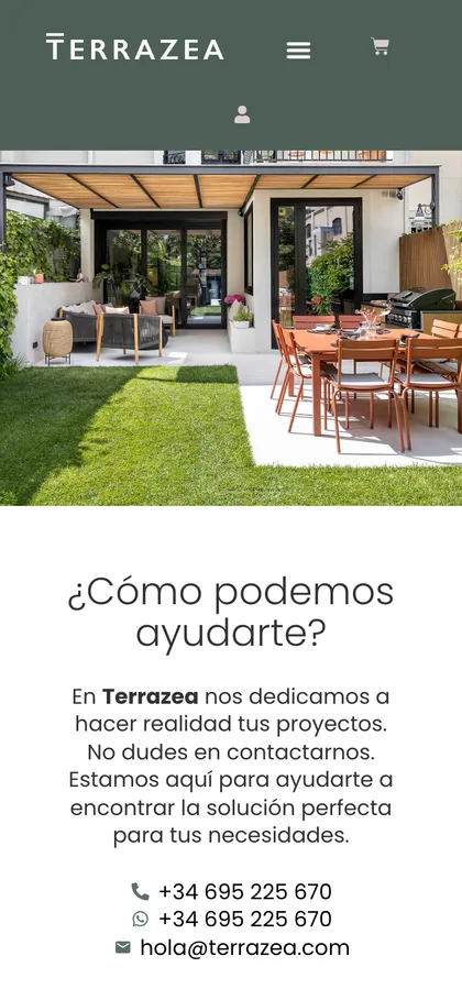
The Terrazea website from top to bottom: real projects, a clear process and contact after every block.
They are not mutually exclusive. The usual approach is to have a full website and create landing pages for each Google Ads or Meta Ads campaign.
If you are just starting out and only sell one service, a good landing page can be your website for a while.
Types of landing page
Lead generation
A short form in exchange for a quote, a consultation or a valuation. The most common type for services.
Sales
A product or service with its price and a buy button.
Booking or appointment
For clinics, garages, restaurants or courses. The goal is for them to choose a day and time.
Download
A guide, a catalogue or a template in exchange for an email address.
Event
Date, venue, programme and a button to sign up or buy a ticket.
The structure of a landing page that converts
There is no magic template, but the structure of a landing page that works usually follows this order, which tracks the doubts of whoever arrives:
- A headline that repeats what they searched for. If the ad said “bathroom renovation in 10 days”, the headline says the same.
- A subheading with the result and who it is for. One sentence, not a paragraph.
- A call to action visible without scrolling, on mobile too.
- Social proof: Google reviews, client logos or a real figure.
- Concrete benefits in three or four points, not a list of features.
- How it works: the steps from when they write to you until they receive the service.
- Answers to objections: price, timescale, guarantee, area.
- A second call to action with the form.
- Short FAQs for the undecided.
Rule of thumb: every block has to bring people closer to the action. If a block does not answer one of the client’s doubts, it is not needed.
Landing page examples
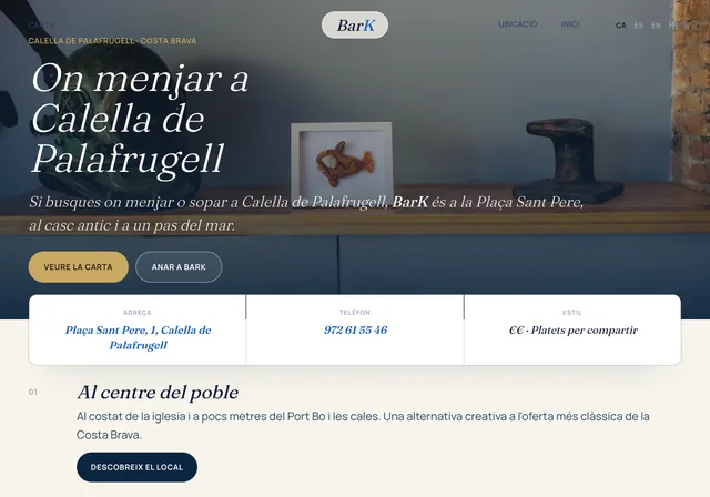
These landing page examples are outlines for typical businesses in our area. Notice that each one has one goal and one action, nothing more.
Landing page example for a clinic
Headline: “First physiotherapy appointment in Mataró this week”. Below it, a “Book an appointment” button and the phone number. Then Google reviews, the treatments in four cards, the team with photos and a map. Form: name, phone and reason for the visit.
Landing page example for a B2B service
Headline: “We automate your company’s invoicing in 4 weeks”. Call to action: “Book a free 30-minute check-up”. Social proof: a case study with a before-and-after figure. Form: name, company, email and number of invoices per month.
Landing page example for an event
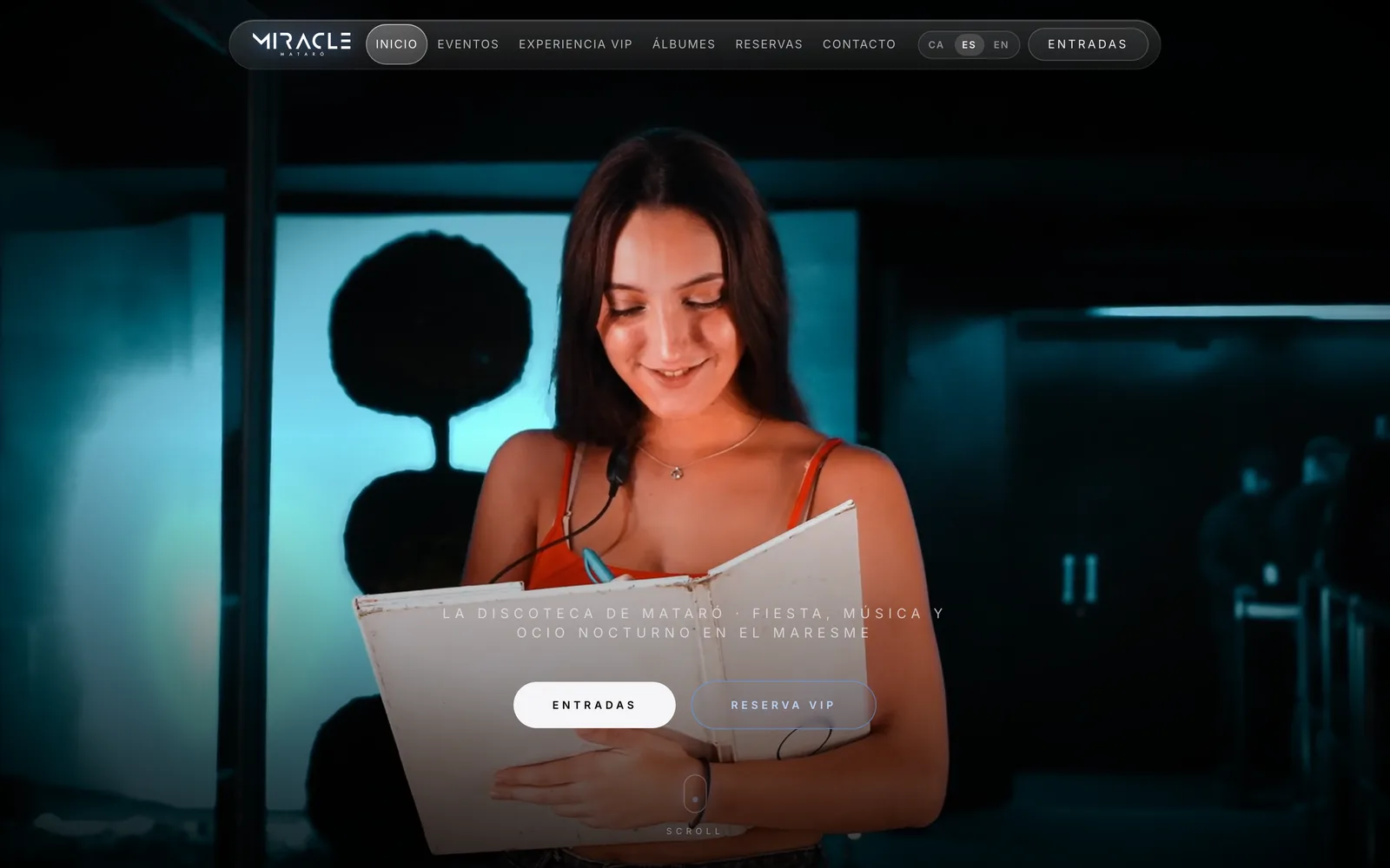
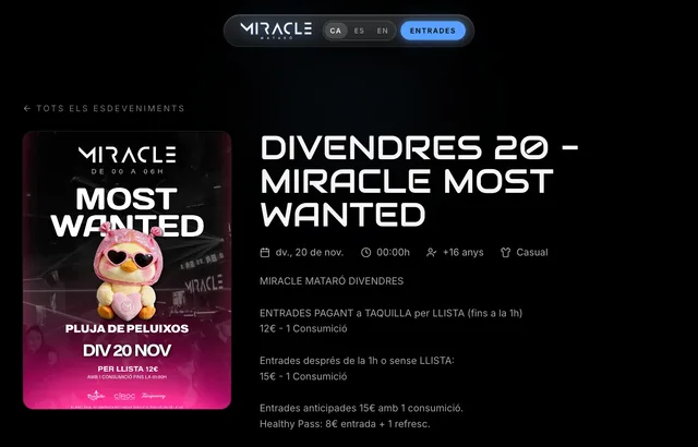
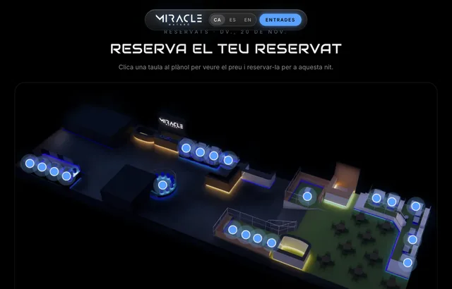
Date, venue and poster at the top, a ticket purchase button, and nothing to distract from paying. That is what we did for Miracle Mataró’s ticket sales, which have issued more than 5,000 tickets without a single incident.
Landing page example for getting quote requests
For an installer or a garage: “Air conditioning quote in 24 h in the Maresme”. A WhatsApp button fixed on mobile, photos of real jobs, the areas covered and a three-field form.

Why your landing page is not converting: 6 mistakes
It is one of the most frustrating patterns we see in companies that already have SEO or invest in advertising: the traffic is there, people arrive, but no forms come in. The problem is almost never the traffic source, but what happens when the user lands.
A poorly planned landing page wrecks the profitability of any campaign, however well optimised it is.
«Increasing traffic to a landing page that does not convert only amplifies the problem. Conversion first, then volume.»
GNERAI team
Mistake 1: the value proposition takes more than 5 seconds to understand
If the visitor does not understand in the first few seconds what you offer, who it is for and why it matters to them, they leave. The most common mistake is a headline full of empty words: “Innovative solutions for your company’s growth”.
That tells nobody anything. A good value proposition answers in one sentence what you do, for whom and what result it achieves.
- Bad example: “We transform your business with cutting-edge technology”.
- Good example: “We build websites and automations for companies that want more clients and less manual work”.
5-second test: show your landing page to someone who does not know it for 5 seconds and ask them what your company does. If they cannot answer, you have a value proposition problem.
Mistake 2: the button does not say what will happen
“Contact us”, “More information”, “Send”. The visitor does not know what happens if they click: will someone call them? Will they get a PDF? When? Buttons that convert are specific: “Ask for a no-obligation quote”, “Book a free 30-minute check-up”, “Download the price guide”. To write them:
Specific
Describe exactly what happens when they click.
Results-focused
“get”, “book”, “download” rather than “send” or “click”.
Clear about the commitment
If it is free or no-obligation, say so.
Visually prominent
It should not compete with other elements for attention.
Mistake 3: there is no social proof at the key moment
Reviews, client logos, case studies and figures reduce the risk of contacting someone you do not know. But many websites put them far from the form, when the visitor needs them right before making up their mind.
Place them one scroll from the button, not three pages away. In B2B, logos and case studies with figures work; in services for consumers, verified Google reviews are more credible than your own testimonials.
Mistake 4: slow loading on mobile
A good share of a campaign’s visits come from phones, often with poor coverage. If the page is slow, they leave before reading the headline. The metric to watch is LCP (how long the main element takes to appear): according to Google on web.dev, a good experience is an LCP of 2.5 seconds or less. PageSpeed Insights tells you for free in half a minute.
Mistake 5: a form with too many fields
Every field is one more excuse not to send it. For a first contact, name, phone or email and a message are enough. Ask for the rest in the first conversation, not on the form.
Mistake 6: silence after the form
The user sends the form and nothing happens. No confirmation email, no call for days. An immediate automatic reply and a call within 24 hours make a big difference to how many enquiries turn into clients. This can be automated without any hassle.
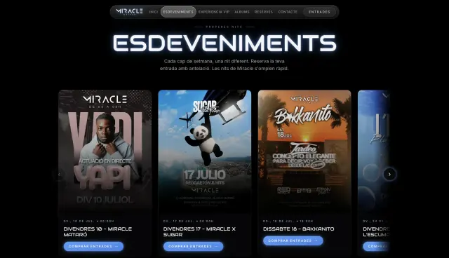 A real case5,000+tickets issued without a single incidentMiracle Mataró · See the project →
Landing page copywriting: how to write the text
Design makes a landing page look good; the copy makes it convert. Four rules we always apply:
- Write in your client’s words, not your industry’s. If they search for “fix a roller blind”, do not write “repair of shading systems”.
- Talk about the result, not the process: “your bathroom ready in 10 days” rather than “end-to-end renovation management”.
- Answer objections before they come up: indicative price, timescale, area, guarantee.
- Short sentences and two-line paragraphs. On mobile, a six-line paragraph is a wall.
How to create a landing page step by step
- Choose a single goal and a single action.
- Define where the traffic will come from (Google, Instagram, an email) and what that person expects to find.
- Write the copy before designing, following the structure above.
- Design for mobile first and then adapt it to desktop.
- Connect the form to your email, your WhatsApp or your CRM, with an automatic reply.
- Measure: install analytics and mark the form submission as a conversion.
- Test and improve: change one thing at a time (headline, button, image) and compare.
Creating a landing page with AI
Today you can create a landing page with AI in minutes: there are tools that generate copy, images and even the whole page from a description. They are useful for a first draft or for testing an idea quickly.
What they do not do for you is know your client, their objections and what really convinces them, and that is what decides whether the page converts. Use AI to speed things up, not to do the thinking.
Creating landing pages with an agency
If you invest in ads, it makes sense for whoever runs the campaigns and whoever builds the landing page to work together. That is what we do in landing page design: copy, design, measurement and campaign within the same team.
How to optimise a landing page: a 30-minute audit
Before investing in more traffic, spend half an hour reviewing your landing page with this checklist:
Value proposition
Does a stranger understand what you offer and for whom within 5 seconds?
Button
Does it say exactly what happens when clicked? Can it be seen without scrolling on mobile?
Social proof
Is there an element of trust less than one scroll from the form?
Speed
Is the mobile LCP below 2.5 seconds?
Form
Does it have more than 4 fields? Which ones can you remove?
Follow-up
Is there an automatic confirmation email when someone sends it?
If you answer no to more than two, you have work to do before increasing your lead generation spend. And if you want a second opinion, we give you one for free in the digital check-up.
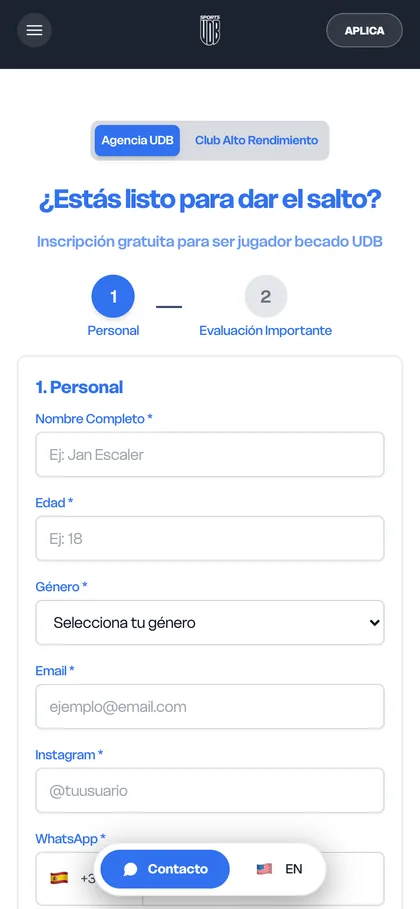
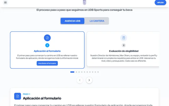
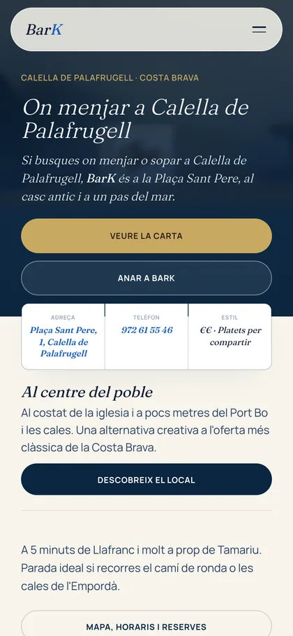
More real examples: UDB Sports
We'll send you our next web design guide
Prices, mistakes and real small-business website examples whenever we publish. No spam.
Guides for your business, in your inbox
What we publish on websites, SEO, ads and AI for small businesses. No spam, unsubscribe in one click.
Frequently asked questions
What does landing page mean?
A landing page is the page someone “lands” on after clicking on an ad, an email or a link, and it is designed for them to take a single action: leave their details, book, buy or download something. It is also known as a destination page.
Landing page: what is it and what is it for?
It is a page with a single goal, with no distractions. It is used to turn visits into enquiries or sales, especially when you pay for every click on Google or social media. By showing exactly what the person was looking for and a single action, it converts better than sending the traffic to the home page.
How do you make a landing page?
Choose a goal and an action, define where the traffic will come from, write the copy before designing, design for mobile first, connect the form to your email or CRM and measure submissions as conversions. Then test changes one at a time to improve it.
What is the difference between a landing page and the home page?
The home page presents your whole business and lets people choose between many paths. A landing page focuses on a single offer and a single action, usually with no menu. That is why, for ad campaigns, a landing page usually converts better than the home page.
What should a landing page have?
A headline that repeats what the person searched for, a clear call to action visible on mobile, proof of trust near the form, concrete benefits, answers to doubts about price and timescale, and a short form. And it should load quickly: an LCP of 2.5 seconds or less.
Can you create a landing page with AI?
Yes. There are tools that generate copy, images and the whole page in minutes, and they are useful for a first draft. What they do not replace is knowing your client and their objections. Review the copy, adjust the offer and measure the results before investing in traffic.
Do I need a landing page or a full website?
If you run ad campaigns, you need landing pages even if you have a website. If you are just starting out and sell a single service, a well-made landing page may be enough at first. To appear on Google with several services and build trust in the long term, you will need a full website.
Why is my landing page not converting?
It is almost always for one of these reasons: what you offer cannot be understood in 5 seconds, the button does not say what happens, there is no proof of trust near the form, it loads slowly on mobile, the form asks for too much information or nobody replies quickly after it is sent.
Further reading
Is your landing page getting visits but no enquiries?
Ask for the free website audit and within 24 hours we tell you what is holding back conversion and what we would change first.